Case Studies

aussiehairguru.com
The Brief.
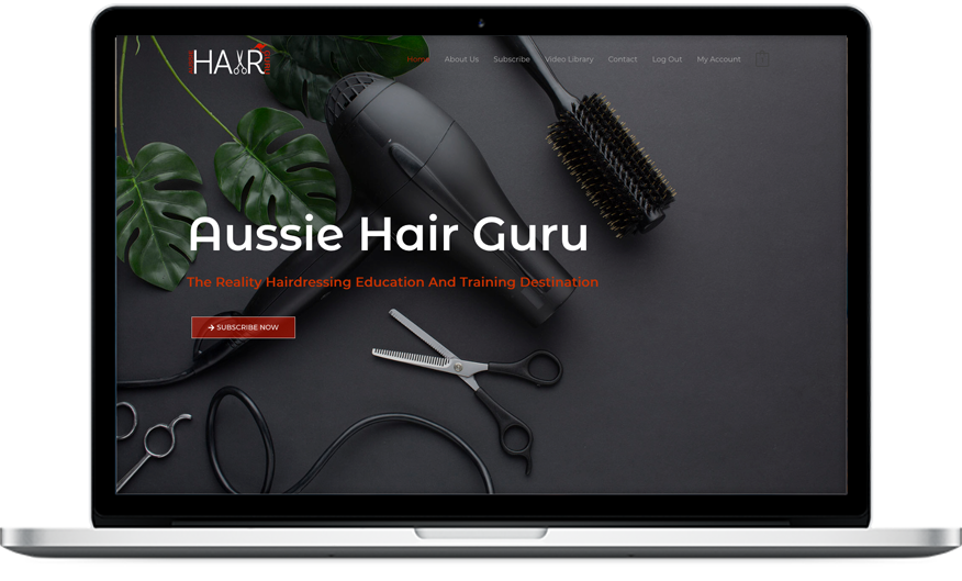
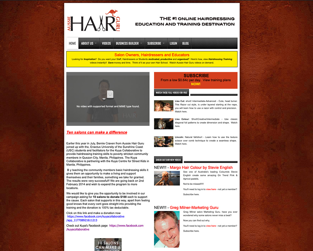
We were tasked with an old Joomla website into a new digital platform for an online hairdressing tutorial site. The site needed to engage and encourage users, with clear call to actions and simple user experience, that lead to the subscription sales page.
Our solution.
One of the first things we did was to incorporate the brand colour as a wash of colour throughout the site and in particular as a contrast to rich dark areas, creating a distinctive, elegant feel.
We integrated an eCommerce subscription system, allowing subscribed clients to view restricted content and seamlessly integrated a PayPal checkout gateway.
A particular challenge was to embed existing Viddler videos that were only accessible to site subscribers and render them unable to be shared. Our solution was to embed the videos at an appropriate viewing size, but without player controls. This ensured the material was locked and secure.
bluegumbuilding.com.au
The Brief.
Blue Gum Building’s existing website was an outdated Joomla site, built prior to the responsive website explosion that changed the face of web design. With little to no optimisation for mobile, Blue Gum Building was being left behind the competition.
Our solution.
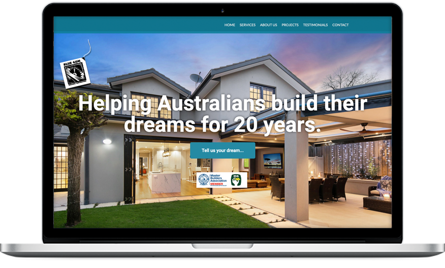
We began from scratch with the new website, featuring a hero image of some of the real-life, amazing work undertaken by Blue Gum Building. The stunning, colourful image immediately brought the new site to life.
As requested by our client, we kept the site very simple and uncomplicated, but nonetheless clear and engaging with subtle movement to attract the eye.
We included past project galleries and simple contact form for enquiries, resulting in a website reflects the professionalism of the company.
addvaluebathrooms.com.au
The Brief.
Our task was to create a modern, fresh interface for a bathroom renovation company. As a west coast business now trading in the east, the highly successful company was an unknown on the eastern seaboard so the message had to quickly establish the company as an expert in its field.
Our solution.
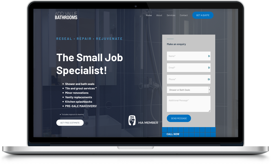
We began the site by carefully matching and accentuating the vibrant and distinctive brand colour blue. We carefully wove this through the site to reinforce the brand, without overdoing the dramatic hue.
It was important to quickly reference the services and USP of Add Value Bathrooms and we incorporated a ‘guarantee’ section to reinforce the expert knowledge of the company, along with an appealing and informative services page.
As the industry is highly competitive, we built in many call-to- action buttons and forms to ensure making contact with the company was quick and easy.


